
Visual Guide · Publishing and communication
Make original visuals that carry evidence
Turn recorded results and inspected mechanisms into clear charts and diagrams. Includes a visual provenance record, caption guide, and accessible publication checks.
In this article
A chart should explain where its numbers came from
The charts in TrendsWhat's starter experiments were generated from recorded result files. The CSV figure reads the two pass counts from the lab output. The validation figure reads the number of records accepted at each gate. We did not draw plausible bars first and then write a story around them.
That distinction is the foundation of an evidence-bearing visual. A reader should be able to understand what the image claims, how it was made, and what material supports it. An attractive picture can help someone begin reading, but it should not make an unobserved result look like a documented event.
This guide explains the visual-production choices used for this publication: original result charts, architecture redrawings based on inspected code, and workflow guides. It also provides a worksheet for using external material responsibly. It is not a claim that every original image proves firsthand experience; the type and caption determine what the visual can establish.
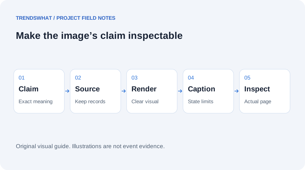
Original TrendsWhat visual-production guide. A diagram and a screenshot can both be useful, but they support different claims.
Three visual jobs that should not be confused
A documentary screenshot records a particular interface or state at a particular time. It can show that a page rendered or that a control was visible. It does not necessarily prove the backend action completed, and a cropped screenshot may omit context that matters. Use it for the state it actually captures.
A result chart summarizes measurements or observations. Its values need a source, its denominator needs a definition, and its axes or labels need to explain the comparison. In our redaction lab, counting the harmless control as a successful case produces a different denominator from counting only sensitive fixtures. The chart's wording makes that distinction visible.
An explanatory diagram shows a mechanism or proposed workflow. Our StockNote approval diagram was redrawn from inspected code. It is not a screenshot of a user approving a transaction. Its caption says so. A proposed process can also be diagrammed, provided the image is labeled as a guide rather than evidence that the process was executed successfully.
Build the visual from an explicit claim
Before designing, write the sentence the image should help the reader understand. For the retrieval lab, the claim is that complete target sentences appeared in one, three, and four top-ranked fragments under three specific chunking strategies. That sentence supplies the metric, comparison, and scope.
The chart then needs enough information to preserve that meaning. A label such as “accuracy” would be too broad because we did not evaluate generated answers. “Complete target sentence in the top result” is more precise. The surrounding text explains the fictional document, lexical ranking, and unequal chunk lengths.
If the claim cannot be stated clearly, making the image more elaborate will not fix it. Simplify the question first. A small table may be better than a chart when exact values and qualifications matter more than a visual trend. The visual's job is to reduce the reader's effort without changing the claim.
Keep data and styling separate
Our chart script reads the recorded JSON and renders SVG files. The data file preserves per-case observations, while the renderer controls colors, spacing, labels, and typography. That separation allows a style change without quietly changing the measurements.
For a small publication, the process can be simple: save the original result, create a presentation script, and keep both beside the manuscript. Record which result version the figure uses. If a rerun changes a count, regenerate the chart and review the related prose rather than manually patching one visible number.
A figure does not need to expose every raw record inside the image. It should provide a route to the underlying material when the reader needs more detail. Our experiment articles include tables and downloadable results so a reader can inspect the aggregate, the individual cases, or the executable procedure.
Captions carry the evidence boundary
A useful caption does more than repeat the title. It identifies the visual's origin, explains what the reader should notice, and states a relevant limit. “Original diagram based on source inspection; no production transaction was submitted” tells the reader how to interpret an architecture picture.
For a chart, mention the dataset and metric. For a screenshot, mention the environment and whether it shows a test or live page when that distinction matters. For a generated illustration, label it as illustrative if it could otherwise be mistaken for a real person, place, product state, or event.
Avoid captions that borrow authority from vague experience claims. “Our proven system” is not informative without evidence. “Three synthetic grouping fixtures passed against an exact source snapshot” is narrower and more useful. The reader can inspect the linked result and decide how much the observation applies to their situation.
Make the meaning available without the image
The W3C guide to complex images explains the need for a short identification and a fuller textual account of the essential information in complex visuals. A chart's meaning should not depend on seeing small labels or distinguishing colors alone.
In this publication, the article text and result tables explain the values shown in the figures. Alt text identifies the comparison, while the body provides the method and limitations. This also helps readers on small screens, slow connections, or interfaces where images do not load.
Write the text alternative around meaning rather than decoration. “Blue bars on a pale background” is rarely the important information. “Five of eight fixtures passed comma splitting; all eight passed CSV parsing” tells the reader what the chart conveys. If a diagram's sequence matters, describe the sequence in the surrounding text as well.
Inspect the actual rendered size
An image that looks clear on a large canvas can become unreadable inside a mobile article. Check it at the width where readers will encounter it. Long labels, tiny legends, and dense arrows can survive export while failing in the page layout.
Use a readable text table alongside detailed charts. Reserve space with known image dimensions so loading does not unexpectedly move the article. Keep the image proportionate to the text column, and verify that it loads from the actual URL used by the page rather than only existing in a local design folder.
A browser check should also inspect the surrounding experience: caption placement, heading order, links to data, and horizontal overflow. A successful image export is only one artifact. The final deliverable is the visual as encountered by the reader within the article.
External material needs a provenance record
When using an external image, record its creator, original source, applicable license or permission, required attribution, and any changes made. Finding an image through search does not establish permission to republish it. A source link and a usage right are different things.
The Creative Commons license overview describes different license conditions, including attribution and restrictions that vary by license. Inspect the specific license attached to the work and whether it fits your intended use and modifications. Do not treat the phrase “Creative Commons” as one uniform permission.
For a monetized publication, resolve the usage conditions before building the article around an asset. If they are unclear, use original material or obtain appropriate permission. This is an editorial sourcing workflow, not a legal opinion about a particular disputed image or a substitute for checking the applicable terms.
Copy this visual evidence record
| Field | What to record |
|---|---|
| Visual purpose | Observation, result summary, explanation, or illustration |
| Exact claim | What the reader should learn from it |
| Source material | Result file, inspected code, original capture, or licensed work |
| Creation method | Capture, plotting script, redrawing, or generation |
| Scope | Test environment, synthetic data, or source-inspection limits |
| Rights | Creator, permission or license, attribution, and changes |
| Text alternative | Essential meaning in accessible text |
| Publication check | Loaded URL, mobile size, caption, and supporting links |
Use the record before publishing, not only when someone asks where an image came from. It makes unsupported visual claims easier to catch. It also helps future maintenance: if a result changes, you can identify which figure and caption need updating.
A worked example from the redaction lab
The lab contains ten fixtures, but only nine have information marked for removal. Five of those nine are fully redacted by the email filter. The harmless control remains unchanged. A chart saying “six successes” without explaining the control would invite the reader to interpret a broader achievement than the sensitive-case count supports.
We therefore show the five-of-nine result and identify the control separately in the article. The image's job is not to maximize the apparent success rate. It is to make the limitation memorable: an email filter leaves other marked information behind.
This is why editorial judgment belongs in chart labeling. The raw counts alone do not choose the fairest denominator or explain what a pass means. The method section, caption, and table work together to preserve the actual question the experiment answered.
Avoid decorative certainty
Visual polish can make a weak claim feel established. A diagram with clean arrows may imply a complete, reliable process even when it is only a proposal. A dashboard-style image can make invented numbers look like real analytics. A generated screenshot can be mistaken for an executed test if it resembles a product interface closely enough.
Label those distinctions explicitly. For this publication's workflow guides, the images describe a recommended sequence and the text explains its status. For the result charts, the downloadable records supply actual observations. We do not use an illustration as evidence of a customer event or an unrun model comparison.
Originality is valuable because it can add understanding that a stock image does not provide. But originality alone is not proof. The visual should contribute a mechanism, comparison, or usable guide, and its presentation should make the supporting evidence easier to inspect.
The standard to aim for
A good editorial visual earns its space by making a specific idea clearer. Its numbers trace to a record, its mechanism traces to an inspected or clearly proposed process, and its caption states the boundary. A reader can still understand the essential information if the image is unavailable.
Start with the claim, choose the right visual job, preserve the source material, and inspect the rendered result. That process produces something more useful than a decorative image added to make an article appear complete. It gives the reader another way to understand and verify the work.
Sources, materials, and limits
- W3C complex-image guidance: text alternatives and explanations for charts and diagrams.
- Creative Commons license overview: primary description of varying license conditions.
- Redaction experiment and recorded lab results: the worked denominator example.
- Original visual record and diagram. No claim that illustrative images document real events, and no legal determination about a specific external asset.